
Datorama Dashboard Overview
Datorama is your place to view your campaigns' results as they’re happening. This guide will show you how to navigate the powerful dashboard we’ve set up for you.
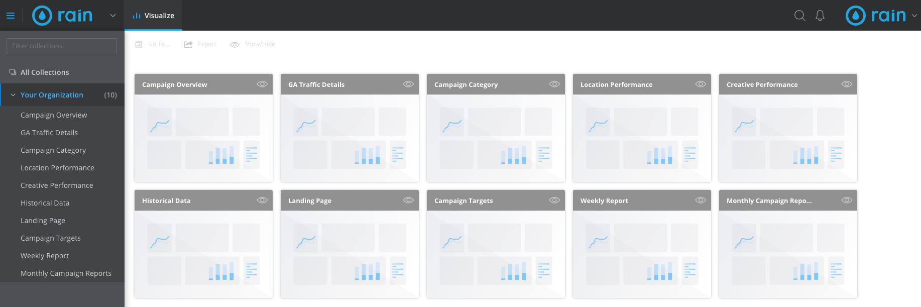
Upon logging into the platform, you should see something similar to the view below. Each of the options in the left-hand menu are dashboards where you can see different data sets and other resources.
Dashboard Overview
Campaign Overview
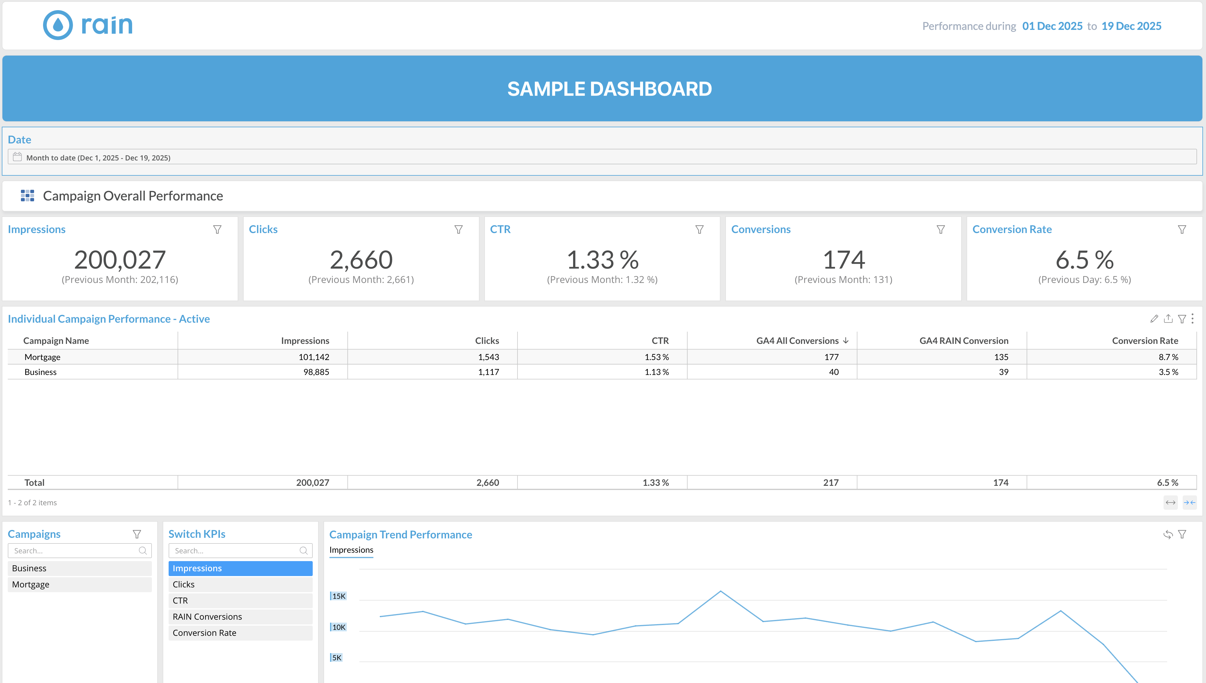
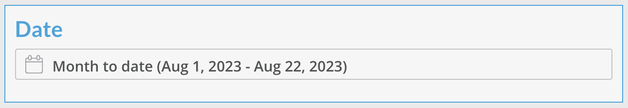
All the tables on this page are governed by this date selector. It is defaulted to the current month, but can be changed to select any date range.
Campaign Overall Performance
This first section is your quick reference to total metrics across all campaigns.
The smaller numbers in parentheses indicate the metric’s value for the same dates of the previous month. When you’re looking at a full month, or the month-to-date, the logic follows the examples below:
8/1 - 8/15 compares to 7/1 - 7/15
7/1 - 7/31 compares to 6/1 - 6/30
Note: full months compare to full months, even if one month has a different amount of days than the other.
This can be confusing when we are selecting more than 1 month. Just take the start & end dates you've selected, move each of them back 1 month, and you'll get your comparison date range. Here are some examples:
10/1 - 11/21 compares to 9/1 - 10/21
1/1/23 - 6/15/23 compares to 12/1/22 - 5/15/23
Individual Campaign Performance - Active
This table displays all campaigns which are/were active for the date range selected.
It can be sorted by each column header.
GA4 All Conversions shows the number of clicks received on all links tagged in the campaign landing page.
GA4 RAIN Conversions shows the number of clicks generated by RAIN. These clicks came directly from our ads. If a user visits your landing page after seeing our ad on a different device or at a later time outside of our reporting attribution period, then it is attributed to GA4 All Conversions.
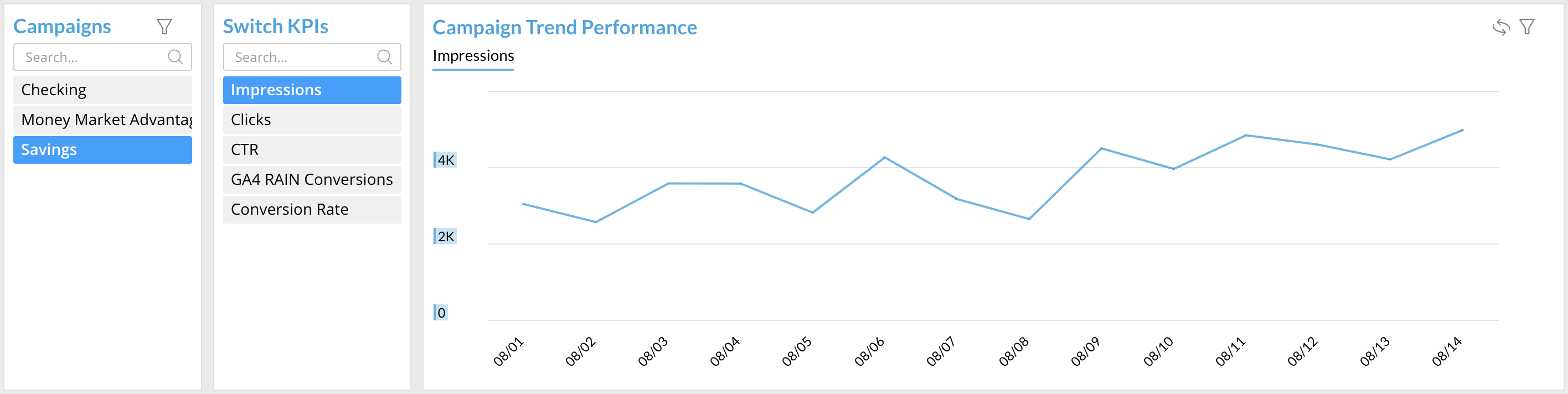
Campaign Trend Performance
The selected items in the two tables on the left affect the line graph on the right.
You can review the results of one campaign/metric, or several at a time by selecting the campaign names and metrics displayed in the tables. Your selections will highlight in blue.
If no campaigns are selected (also the default), the graph will show cumulative data for all campaigns. Impressions will be highlighted by default.
Individual Campaign Performance - Inactive
This table shows all campaigns that were inactive during the date range you selected.
Even if the campaign is inactive, GA4 All Conversions may show numbers because we do not remove our connections from Google Analytics.
GA4 Traffic Details
This dashboard shows Google Analytics data for campaigns which are/were active for the date range selected.
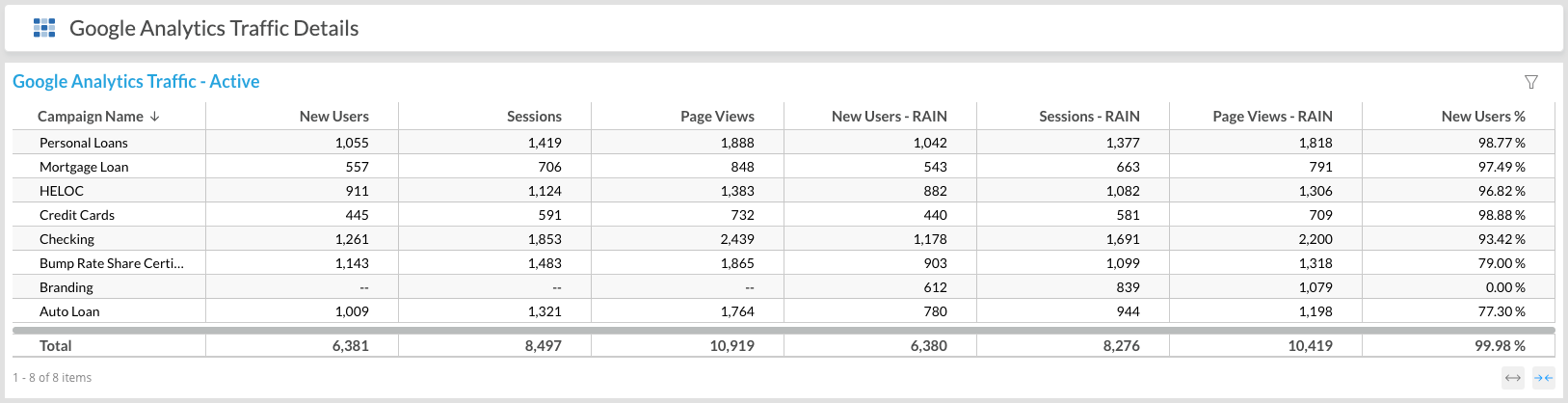
Google Analytics Traffic - Active
This grid can be sorted by each column header.
New Users shows the number of new users that browsed the campaign landing page.
Sessions shows the number of sessions that the users browsed the campaign landing page.
Page Views shows the number of times the campaign landing page was browsed.
Metrics with “- RAIN” appended to them refer to the numbers generated by RAIN directly from ads.
New Users % calculates the percentage of new users driven by RAIN vs. all new users.
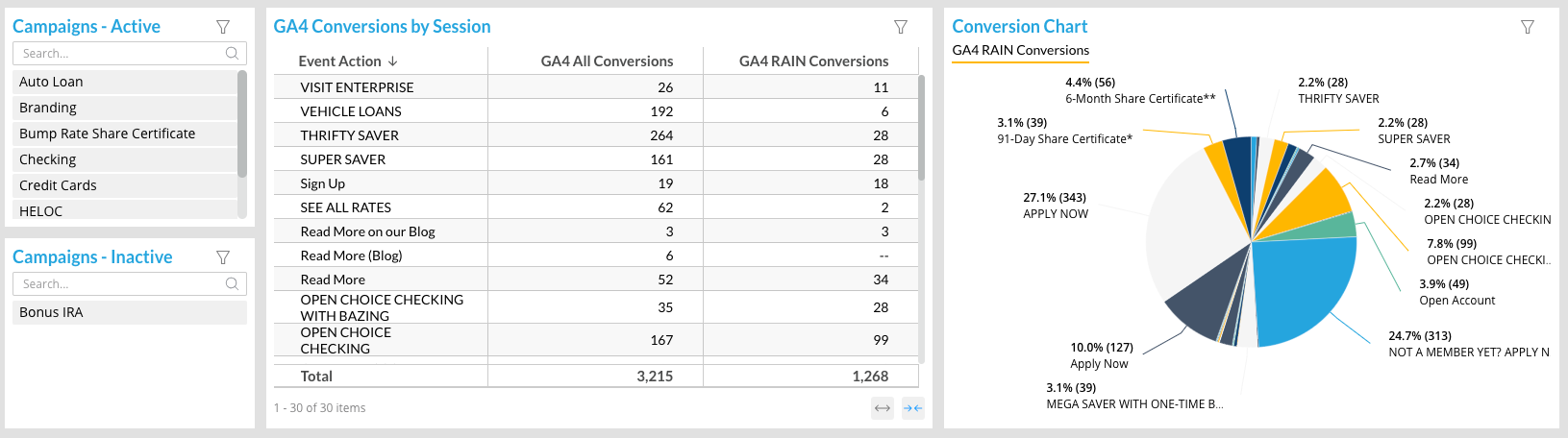
GA4 Conversions by Session & Conversion Chart
You can review the results of one campaign at a time by selecting each of the campaign names displayed in the tables. Your selection will highlight in blue.
The GA4 Conversions by Session table as well as the Conversion Chart pie graph show the details of conversion data on the selected campaign’s landing page.
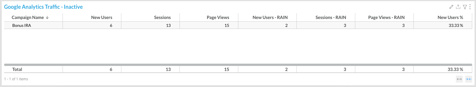
Google Analytics Traffic - Inactive
This table shows all campaigns that were inactive during the date range you selected.
Even if the campaign is inactive, traffic details may show numbers because we do not remove our connections from Google Analytics.
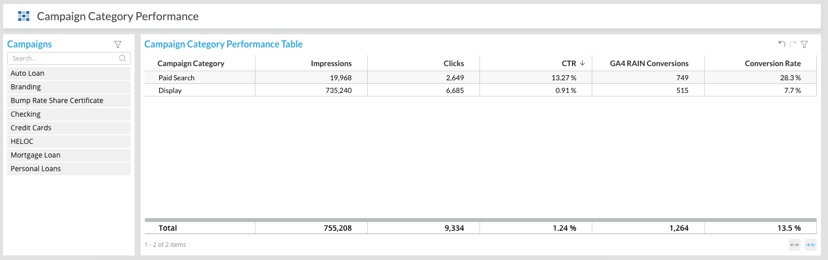
Campaign Category
This table shows your campaigns' metrics by campaign type: Paid Search and Display
This tab will only be visible if you are running both Display and Search ads.
You can review the results of one campaign or several at a time by selecting the campaign names and metrics displayed in the Campaigns table. Your selections will highlight in blue.
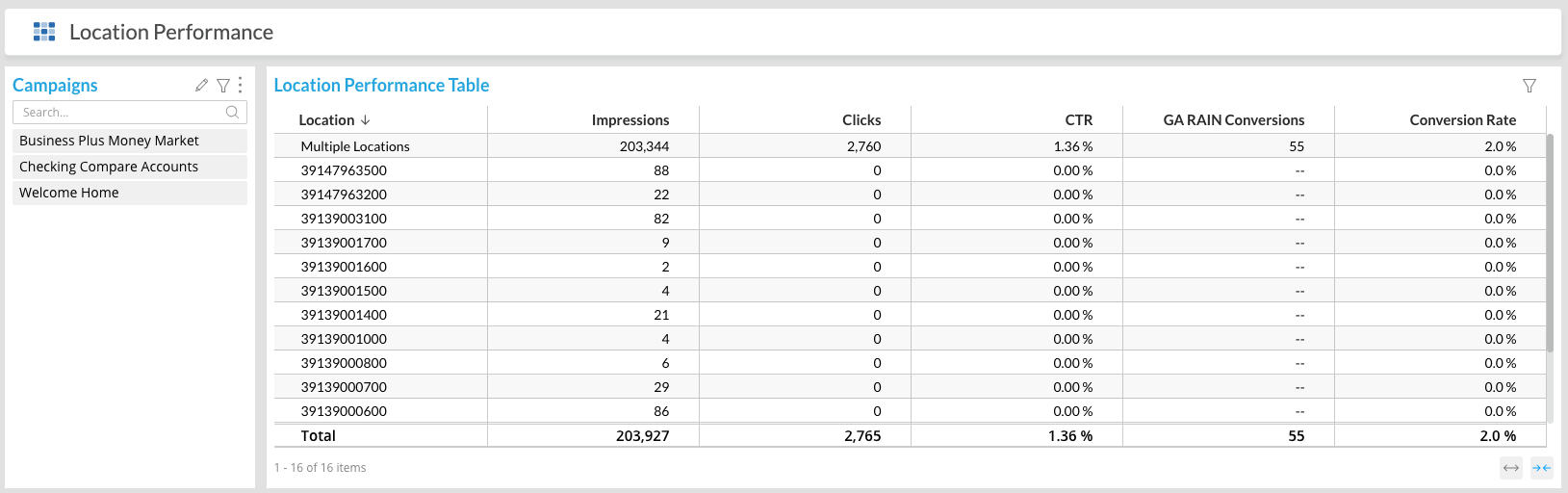
Location Performance
This table shows campaign performance for each targeted location.
This tab will only be visible if one or more of your campaigns are separated by geographic location.
You can review the results of one campaign or several at a time by selecting the campaign names and metrics displayed in the Campaigns table. Your selections will highlight in blue.
Numbers-only location names, such as the ones you see in the screenshot below, indicate Census tracts.
When location information could not be extracted from DSPs, or if there are too many within a single campaign, Datorama will report “Multiple Locations” as a default value.
Future updates to Datorama will allow more locations to be shown.
Creative Performance
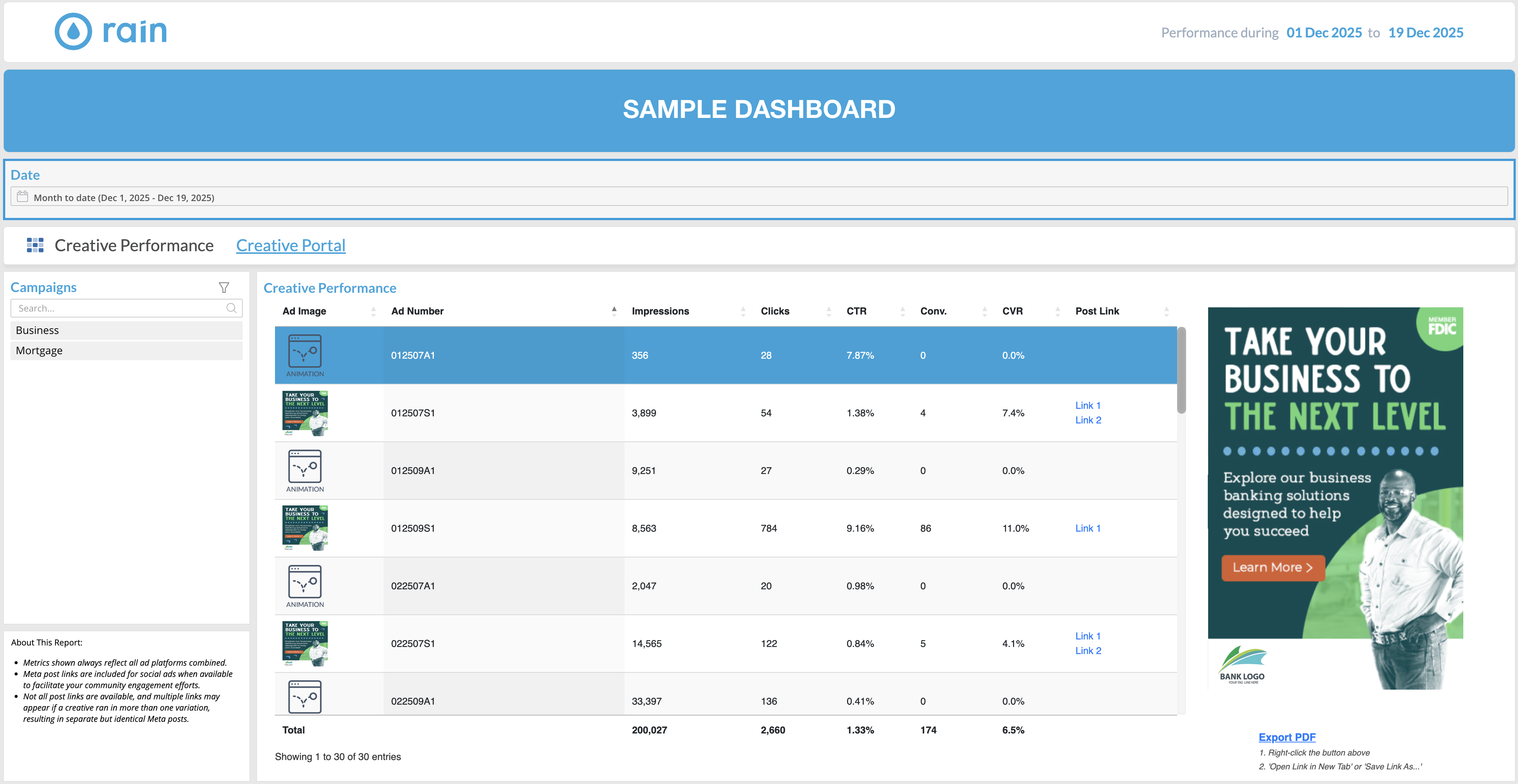
This table shows you the performance of your specific ad creatives.
It’s best to review the results of one campaign at a time by selecting the campaign names and metrics displayed in the Campaigns table. Your selections will highlight in blue.
When a campaign has video or animated creatives, you will be able to view them on the right, where you can see the expanded ad. Click on the video you want to watch and use the viewer to the right of the table to play/pause.
There will be occasions where a conversion cannot be attributed to a specific ad creative. In that case, you’ll notice a row showing Unattributed.
This often happens when a user sees an ad, doesn’t click it, but then visits the landing page through some other path within our reporting attribution period. The click is rightfully reported under GA4 RAIN Conversions, but we cannot attribute it to a specific ad creative.
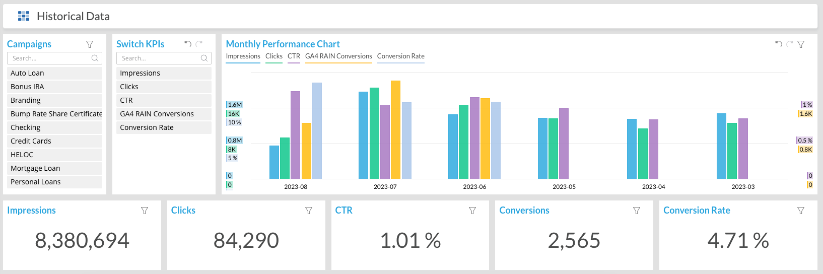
Historical Data
This dashboard gives you a 6-month view of your active campaigns' most important metrics.
You can change the Date selector to view different date ranges in both the graph and the totals below. 6 Months is just the default view.
You can review the results of one campaign/metric, or several at a time by selecting the campaign names and metrics displayed in the tables. Your selections will highlight in blue.
Landing Page
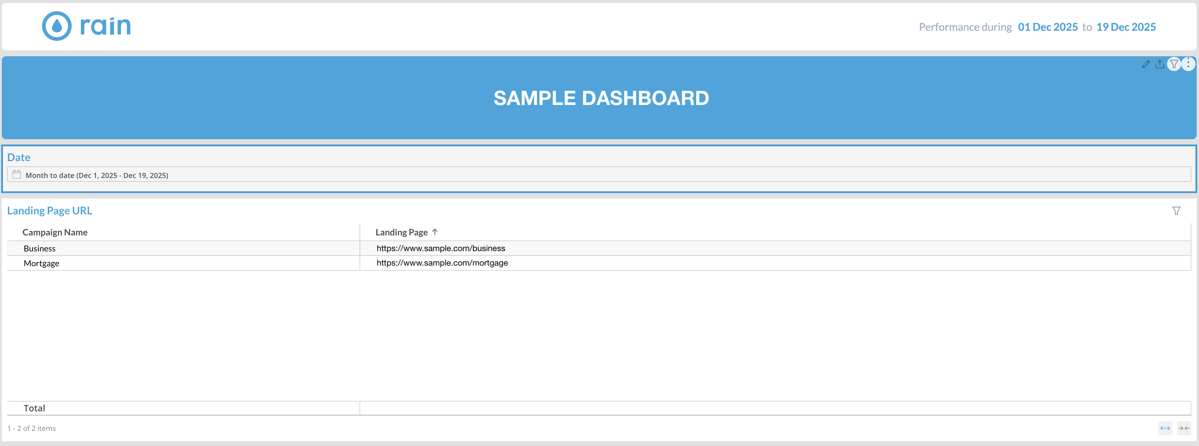
This table shows the landing page URLs users were directed to for each of your ad campaigns.
Target Locations
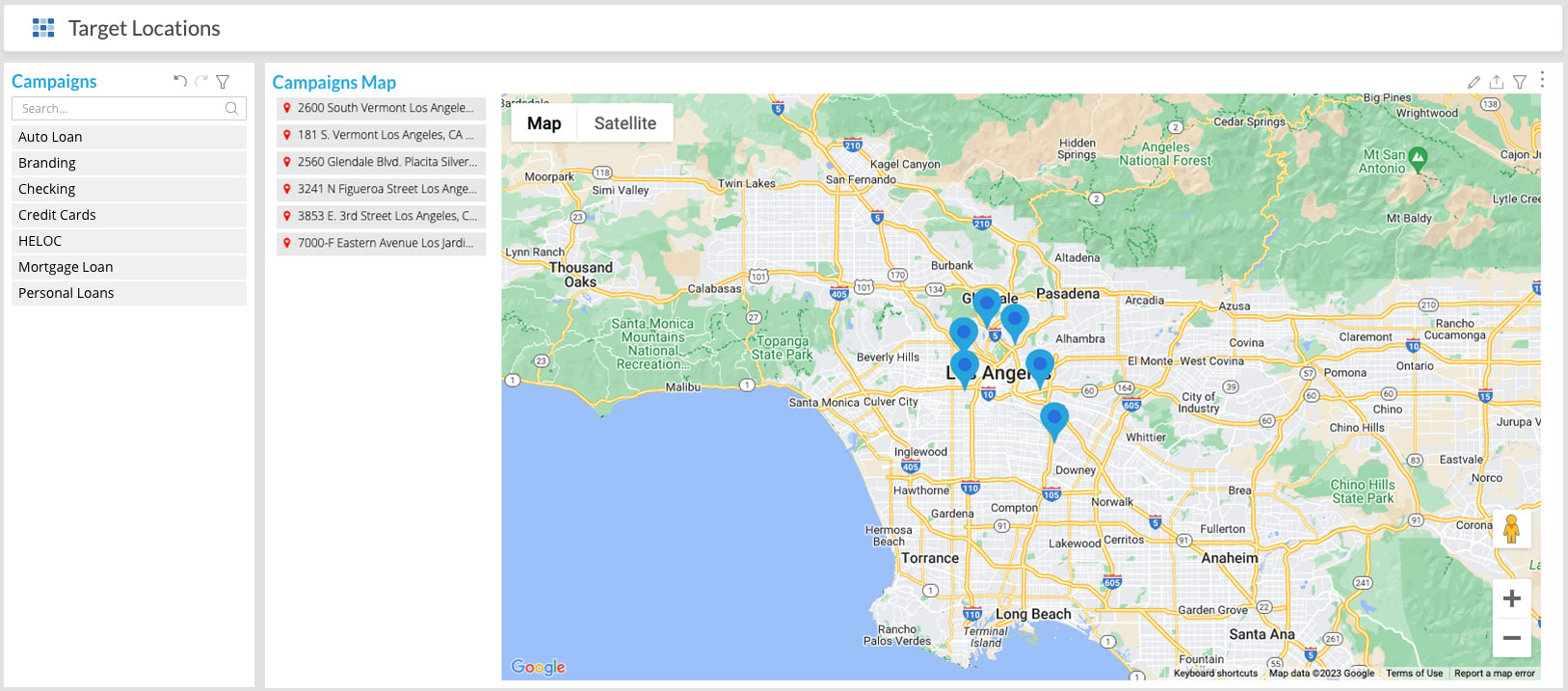
This dashboard displays a detailed map of the locations that were targeted for each of your active campaigns during the date range selected.
Select one campaign from the Campaigns table to see all the targeted locations for that campaign on the map. Without selecting a specific option in the 2nd table, all targeted locations will be pinned. Select a specific map from the Campaigns Map table to see a more specific, zoomed in map.
Weekly Reports
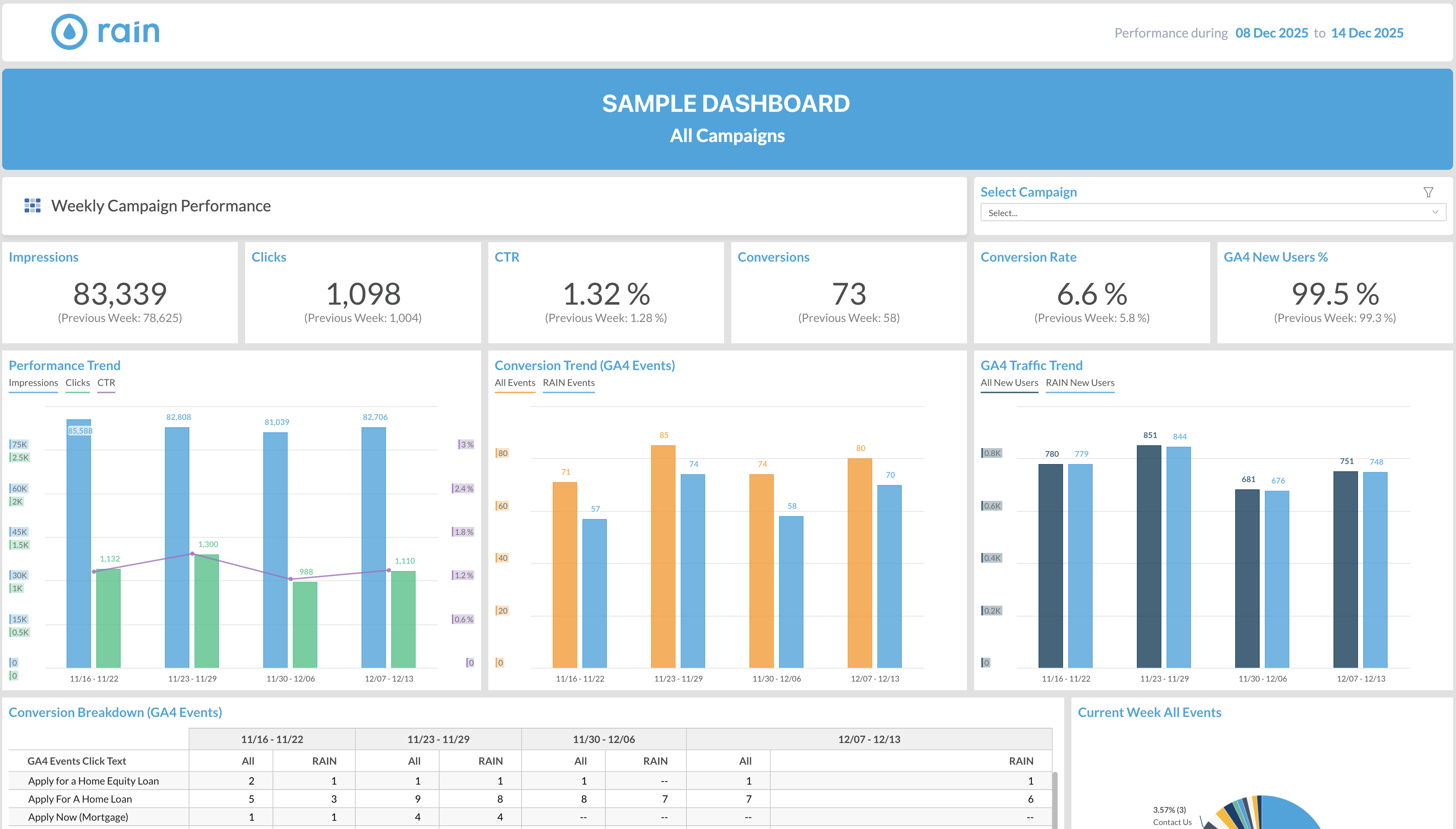
This is a weekly report standard template that can be delivered via email to any person in your organization that you wish. We can also customize this dashboard to some extent—please let your sales representative know if you and your team are interested in receiving these reports or customizing them in any way.
Monthly Campaign Reports
This table displays the active campaigns we’ve run each month, as well as links to monthly reports and insertion orders.